Five Useful Essentials To Rebranding Your Instagram
July 1, 2021
WARNING!
MUST-HAVE INFORMATION BELOW


-
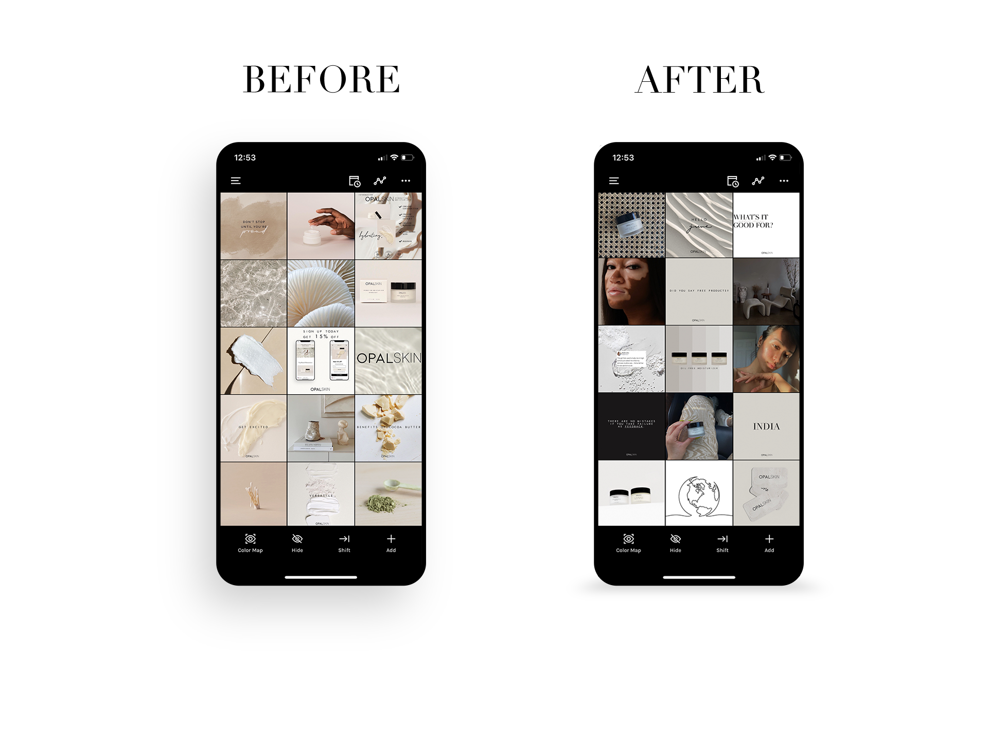
Instagram Grid Template
One of the best things you should invest your time in is post-placement strategy. This will not only help you in arranging your IG post but it will help you to stay consistent making your brand easier to follow. Check out my highly requested Instagram Grid Template HERE.

2.FONT SELECTION
Selecting your font choice can be overwhelming especially when you have so many choices to select from. To make your life a bit easier it is best to stick with a primary font as the font used for headers and a secondary font used for your text. Minimizing your choices to two choices it will help to improve your feed and help keep it simple.

3. cOLOR PALETTE
When it comes to picking the color palette for your page it is essential to make sure you pick THREE solid colors to use consistently. Select three colors that work well with visioning your brand and its message. I recommend selecting 2 neutrals and one pop color to differentiate yourself as a brand.

4.PHOTO EDIT
These are more of the common tips with it comes to branding your feed. Using one filter for all your photos is the easiest way and a very important step to ensure your feed will look professional and clean. I offer easy-to-use presets that will help you achieve this step even easier when you are ready to start rebranding.
Find them HERE.

5. PINTEREST
Who doesn’t use Pinterest these days? This platform is essential when it comes to finding your “inspiration” when your mind has hit a blank on those creating days. Not only can you find IG post ideas it’s a creative resource for sourcing out filler posts for your platform that work exclusively with your brand and its message. Use this as your bible for rebranding your feed.
NEED HELP WITH REBRANDING YOUR INSTAGRAM FEED?
it’s a match made in heaven…
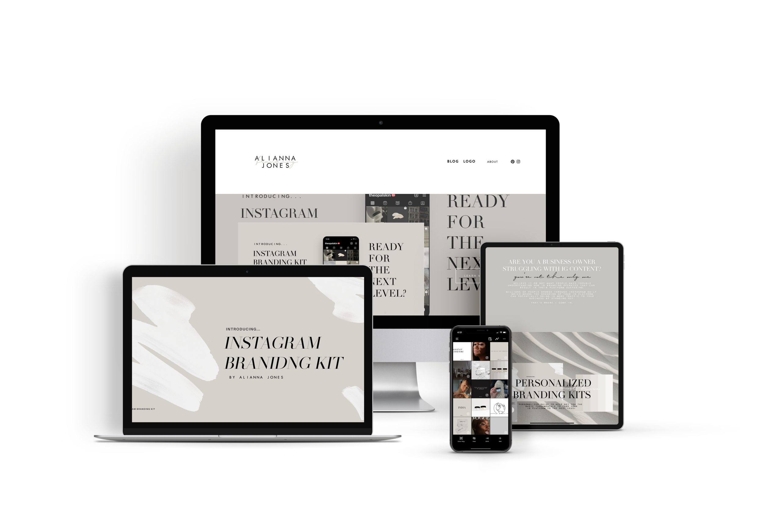
INSTAGRAM BRANDING KIT

INCLUDES
-
BRAND GOAL
-
Color pallete
-
Color Variations
-
fONT selection
-
Image direction
-
texture INSPIRATION
-
IG GRID TEMPLATE EXPLAINED
-
5 EDITABLE IG POST TEMPLATES
-
Digital Application
Subscribe
Sign up with your email address to receive news and updates.
We respect your privacy.
Leave a Reply Cancel reply
luxury SOCIAL MEDIA services
Alianna Jones
Email: hello@nimalstudios.co
Phone Number: +1 866-566-3179
---
**Alianna Jones**
Email: hello@nimalstudios.co
Contact Us: +1 866-566-3179
---
Want me to tweak the labels or layout at all?
Email: hello@nimalstudios.co
Contact Us: +1 866-566-3179
Email: hello@nimalstudios.co
Contact Us: +1 866-566-3179